 seolounge
Think about the last time you landed on a company’s website. You didn’t read it, did you? You glanced. A few seconds later, you either kept going or you left.
Your buyers do the same thing to you.
They click your link, your page opens, and before they read a single full line, they’ve already formed an opinion. And that opinion is quick. A Carleton University study found people judge how a web page looks in about 50 milliseconds, one twentieth of a second. Even when they looked at the page much longer, that first snap judgment barely moved (Lindgaard et al., 2006).
So you don’t get minutes to make your case. You get a glance. And everything the buyer notices after that is shaped by what they felt in that first second.
First impressions are faster than five seconds, but decisions are slower
You’ve probably heard of the “5-second rule” for websites. It’s a handy idea, but the research shows two things, and both matter.
First, people judge how a page looks even faster than five seconds. And looks matter because of something simple: if a page looks clean and professional, people assume the company is good too, before they’ve seen any proof. Stanford studied this. When people said why they trusted or didn’t trust a website, the thing they mentioned most was the design, in 46.1% of comments, more than the actual information (Fogg et al., Stanford, 2002–2003).
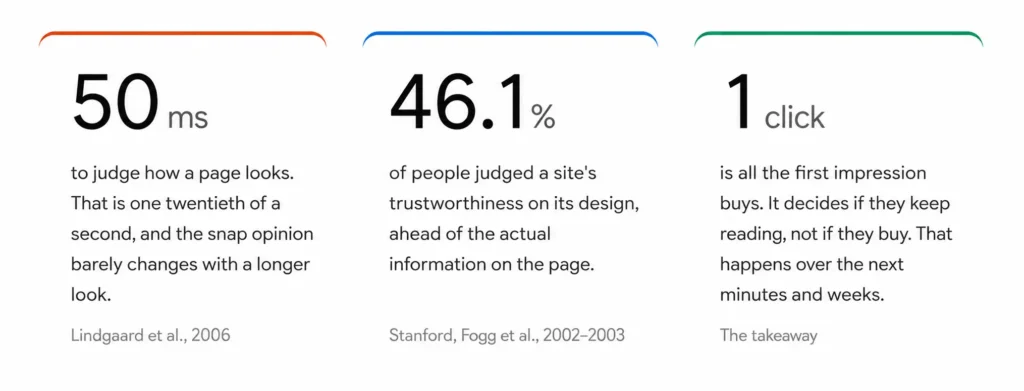
Second, and this is the good news: a fast first impression isn’t the final decision. Liking how you look isn’t the same as choosing to buy. The first few seconds decide if a buyer keeps reading. The next few minutes, or weeks, decide if they pick you. So you’re not trying to win the deal in five seconds. You’re just trying not to lose it, and to earn the next click.
This changes what you should focus on. You don’t need a fancy, award-winning homepage. You just want the buyer’s first thought to be: this looks real, this is about my problem, I’ll read one more line.
What buyers are actually asking in those first seconds
When someone lands on your page, they’re quietly asking a few quick questions. Your page either answers them or gets in the way. Here’s what they’re really asking, and how a weak page and a strong one each respond.
Weak Signal
“Driving the future through intelligent digital transformation.”
Strong Signal
“We build software that lets city officials monitor traffic, waste,
water, and streetlights from one dashboard.”
Why it matters
Confusion is friction, not intrigue. If they can’t tell what you do
fast, they leave instead of asking.
Weak Signal
“Solutions for enterprises of all sizes across all industries.”
Strong Signal
“We help mid-sized manufacturers cut unplanned machine downtime.”
Why it matters
Buyers need to see themselves in it. Specificity signals focus and is
more persuasive than a feature list.
Weak Signal
“Trusted by leading companies.”
Strong Signal
Real logos, a named case study, a testimonial with a real name and
role, a meaningful certification like ISO 27001.
Why it matters
Trust is built with evidence, not the word “trusted.” Specific and
verifiable beats vague and self-congratulatory.
Weak Signal
Spelling errors, broken links, inconsistent or dated design.
Strong Signal
Clean navigation, readable type, current information, no obvious
mistakes.
Why it matters
The brain treats sloppiness as a proxy for how you’ll handle the work.
Credible is not the same as expensive.
Weak Signal
“Innovative,” “world-class,” “next-generation,” “cutting-edge.”
Strong Signal
“We deploy in phases so you see results in the first 90 days.”
Why it matters
If a competitor could paste your differentiator onto their own site,
it isn’t one. Generic claims push buyers toward the cheapest option.
Weak Signal
“We reduced a city’s average emergency response time.”
Strong Signal
“We cut a city’s emergency response by X minutes across Y districts.”
McKinsey found smart-city deployments can cut response times 20–35%.
Why it matters
Proof implies you’ve done this before, for someone real. Numbers tied
to a named source beat a paragraph of adjectives.
Buyers Don’t Buy Your Technology. They Buy What It Does for Them.
This deserves its own section, because technology companies get it wrong more than anyone, and it is usually the difference between a page that connects and one that does not.
Consider two ways of saying the same thing.
Feature-led: “We use IoT, AI, GIS, cloud computing, and real-time analytics.”
Value-led: “We help city officials watch waste, water, traffic, and streetlights from one place, so they catch problems sooner and make better calls.”
The first version lists the ingredients. The second describes the meal. Buyers, especially the non-technical decision-makers who often hold the budget, care about the outcome before the mechanism. The technology matters, but it matters as the reason to believe the outcome is real, not as the headline. Lead with what changes for the buyer, then let the technology support the claim. Reverse that order and you sound like every other vendor, and you lose the person who does not already speak your language.
You can see this play out in the smart-city market, where the biggest names often describe “self-optimizing urban ecosystems” and “intelligent digital infrastructure.” Those phrases are not wrong, but they ask the reader to do the translation. The vendors who say “reduce the time it takes to get an ambulance to a scene” do the translation for the buyer, and buyers reward that.
What makes buyers leave within seconds
Sometimes the fastest way to improve a first impression is to remove the things that quietly repel people. Based on the credibility and usability research, and on what shows up again and again in buyer behavior, here is what tends to send visitors away before you get a chance:
- A headline that is clever but unclear, so no one can tell what you do
- Generic messaging that could belong to any competitor
- A wall of jargon that assumes the reader already speaks your language
- Design that leans on obvious stock photos and says nothing specific
- No proof anywhere: no logos, numbers, names, or results
- A slow page, or one that behaves badly on a phone
- Content that is visibly out of date, which reads as neglect
- Too many calls to action competing for attention, so none wins
- No clear sense of who the product is for
- Long, dense blocks of text with no visual hierarchy to guide the eye
- A broken link or a spelling mistake in the first thing they see
- No obvious contact option and no clear next step
None of these are exotic problems. They are ordinary, and that is exactly why they are worth auditing. Most first impressions are lost not to a dramatic failure but to a pile of small, fixable frictions.
How the big players handle the first five seconds
Let’s make this real. Here’s how the biggest smart-city vendors present themselves, because the same patterns show up on most B2B tech sites. This isn’t about picking on anyone. Several do things well, and the goal is to learn from them, not attack them.
| Buyer Factor | Siemens | Cisco | IBM | Hitachi | Honeywell | What Most Buyers Need |
|---|---|---|---|---|---|---|
| Message Clarity | Abstract, vision-led | Clearer problem framing, product-name heavy | Platform and IT-led | Broad “social innovation” theme | Plainest, outcome-led | A plain sentence on what you do |
| Business Outcomes vs Technology | Tech and sustainability first | Outcomes plus network architecture | Data and platform first | Operational tech plus IT | Outcomes first | Outcome first, tech as support |
| Real Projects Shown | Strong (Manchester, EU projects) | Strong (deployed city networks) | Legacy Smarter Cities work | Yes (smart campus, transit) | Yes (India smart-city projects) | At least one concrete, named project |
| Non-Technical Readability | Lower, more abstract | Medium | Lower, more abstract | Medium | Higher | Understandable to a non-expert |
| Proof of Measurable Results | Present but high-level | Present | Present | Present | Present | Specific numbers, not adjectives |
| CTA Clarity | Soft (“Learn more”) | Soft | Soft | Soft | Soft | One obvious next step |
| Implementation Explained | Thin | Thin | Thin | Thin | Thin | What deployment actually involves |
Honeywell leads with plain outcomes: faster emergency response, better waste, lighting, and mobility. That’s easy for a non-technical official to follow. Cisco names the buyer’s real pain, describing how cities end up with fragmented, one-off deployments that are hard to maintain and secure. Siemens shows real proof, like its work on Manchester’s Oxford Road Corridor, where a city-level energy platform cut bills and carbon and flattened peak demand. These are genuine strengths.
But the shared pattern matters more. Across all five, the messaging stays abstract, the technology arrives before the outcome, and almost none of them explain what buyers most want to know: what implementation looks like, and what happens after the deal is signed. That gap is not a weakness to mock. It is an opening.
What competitors don’t explain well
When you study enough of these pages, the same missing pieces appear over and over. These are the questions buyers are asking that most vendors leave unanswered, which means answering them clearly is one of the cheapest ways to stand out:
- What does implementation actually look like, step by step?
- How long does a typical deployment take?
- What happens after go-live, and who supports it?
- What does the buyer need to provide from their side?
- How does this connect to systems they already run?
- How is success measured, and when should they expect to see it?
- What happens when something breaks?
- How can they estimate a realistic return before committing?
- What does the first 90 days look like in practice?
Notice that none of these are about features. They are about risk and effort, the two things a buyer is quietly worried about. A brand that answers them early does something powerful: it removes the buyer’s biggest unspoken fears before a sales conversation even starts. In a world where, per Gartner, most of the buying journey happens without the seller present, being the vendor who already answered the hard questions is a real advantage.
The 5-Second Brand Test
Here is a simple way to audit your own first impression. Open your homepage the way a stranger would, count to five, and check whether each of these lands.
Second 1 — Recognition. Can someone tell what you actually do, in plain words, without scrolling?
Second 2 — Relevance. Can the right buyer tell that you are for them specifically, not for everyone?
Second 3 — Credibility. Is there a visible reason to believe you, such as a real result, a named client, or a meaningful certification?
Second 4 — Differentiation. Is there one concrete thing that makes you a different choice, not just a claim of being better?
Second 5 — Action. Is the next step obvious and single, so the buyer knows exactly what to do?
If any of the five is missing, that is where you are losing people, and it is usually fixable without a redesign.
Before-and-After Examples of Better Brand Messaging
The fastest improvement most companies can make is to rewrite their own words. Here are three illustrative rewrites. These are examples, not real company copy, meant to show the shift.
Example 1
Before: “We provide innovative, scalable, next-generation smart-city technologies.”
After: “We help cities monitor traffic, waste, water, and streetlights through connected sensors and one live dashboard.”
The after version wins because it names what the buyer gets. The before version could describe a hundred companies, so it describes none.
Example 2
Before: “Empowering enterprises to achieve operational excellence through data-driven synergy.”
After: “We help operations teams find and fix production bottlenecks before they cost you a shift.”
The after version names a specific person and a specific pain. Someone reading it thinks, that is my job, and keeps reading.
Example 3
Before: “A holistic, end-to-end platform for the connected future.”
After: “One platform to manage all your field sensors, so your team stops switching between five different systems.”
The after version describes a real annoyance the buyer already feels. Recognition is persuasive. Abstraction is not.
In every case, the change is the same. Trade the impressive-sounding words for the specific ones, and trade the description of your technology for a description of the buyer’s better day.
What this means for B2B technology companies
If you sell IT services, SaaS, cybersecurity, cloud, smart-city systems, enterprise software, data analytics, or anything with “AI” in the pitch, this applies to you with extra force, because your field is more crowded with jargon than most.
Your buyer wants to understand, quickly, a short list of things: what problem you solve, who you solve it for, whether you have done it before, and what it will take to work with you. A cybersecurity buyer wants to know what threats you actually stop, not a tour of your architecture. A SaaS buyer wants to know what their day looks like after they adopt you, not your feature count. A smart-city buyer wants to know what improves for residents and how the rollout works, not a list of protocols. The technology is your proof, not your pitch. Lead with the outcome, back it with evidence, and make the next step obvious. Do that, and you will already be clearer than most of the market, including some of the largest names in it.
The 10-point first impression checklist
A marketing manager can use this to audit a homepage in ten minutes. For each item, the honest answer should be yes.
- Can someone tell what we do within five seconds, in plain language?
- Is it obvious who our ideal customer is?
- Is our main benefit clear, not buried?
- Do we show real proof, such as results, logos, or named projects?
- Do we lead with outcomes rather than only technology?
- Do we show real customers or real projects, not just stock imagery?
- Is the site easy to navigate on both desktop and phone?
- Is the content readable by a non-expert in our field?
- Do we state one concrete thing that makes us different?
- Is there a single, obvious next step?
If you score below eight, you are not losing buyers because your product is weak. You are losing them before they ever learn how good your product is.
Conclusion
The point of a strong first impression is not to look impressive. It is to make a buyer understand you, believe you, and remember you, faster than they can with anyone else on their list. Impressive is about you. Clear is about them, and clear is what wins.
So do the uncomfortable thing. Open your own brand the way a stranger would, from a Google result or a cold LinkedIn click, and look at it for five seconds without explaining it to yourself. Can you tell what it does, who it is for, why it is credible, what makes it different, and what to do next? If not, that is not a failure. It is the most valuable to-do list you will write this quarter. Your buyers are already judging you in those seconds. The only choice you have is whether to make those seconds work for you.
Is Your Brand Clear Enough to Win the Click?
If buyers cannot quickly understand what you do, who you help, and why they should trust you, they may never reach your sales team.
Frequently Asked Questions
How quickly do people form a first impression of a brand online?
Very quickly. Research from Carleton University found people judge a web page’s visual appeal in about 50 milliseconds, and that snap judgment tends to stick (Lindgaard et al., 2006). A full understanding of what you do takes a little longer, but the gut reaction is almost instant.
What makes a good brand first impression?
Clarity first, then credibility. A buyer should be able to tell what you do, who it is for, and why they should believe you, all without effort. Specific words, real proof, and a clean, consistent design do most of the work.
Why does website design matter so much for B2B buyers?
Because most of the B2B buying journey happens on screens, not in meetings. Gartner found buyers spend only about 17% of their journey with suppliers. Your site is forming opinions while you are absent, and design is the first thing it communicates.
How can a company build trust quickly?
Show, do not tell. Replace phrases like “trusted by leading companies” with actual logos, named case studies, real results, and meaningful certifications. Stanford’s research found that people judge credibility heavily on what they can see, so visible, specific proof matters most.
What makes a B2B website credible?
Consistency and care. Clear navigation, current information, readable design, honest specifics, and no errors. Credible is not the same as expensive. A simple site that pays attention to detail beats an elaborate one that does not.
What should appear above the fold?
A plain statement of what you do and who it is for, one clear proof point, and one obvious next step. If a stranger sees only that top section, they should still understand you.